Miami Graph
In 2015, the city of Miami released the official numbers for the 2016 projected budget. As part of Code for Miami, a group of activist coders, dedicated to using open data to from the city to make useful tools like live bus trackers and budget proposal visualizations.
The release of the budget data was announced in a meeting, and before I knew what was going on I had volunteered to make a visualization out of it.
How I Made It
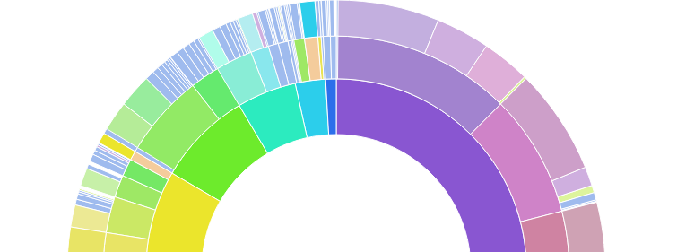
The truth is, I had seen an amazing visualization on D3.js' website. An example visual of an interactive pie chart with tiered breakdowns of the data. Perhaps I had already made the connection between that open source visual and the budget data when I volunteered. Maybe the idea came later. The long and short of it all was that I used that D3 visual as the basis from which to represent the budget data we had. It was my first project with D3 and I was eager to see the picture I had in my mind. Here's the result:
The Press
It didn't take long to fit the data to the graph and aesthetically rearrange the colors to make the wheel look like a rainbow. When I shared the results with the group, the reception was very enthusiastic! One colleague who saw potential in the project approached me about working together to market it. At the same time, someone from the local hip publication "The New Tropic" asked to do a story on the project. Here it is: